COMMING SOON
COMMING SOON

Packaging Design
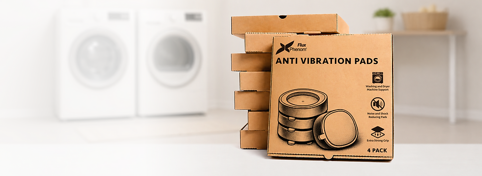
Anti Vibration Pads
I designed this packaging to make the product easy to understand at a glance. Since Anti Vibration Pads are a practical household item, I focused on clear messaging, bold typography, and simple icons to quickly communicate the key benefits,r educing noise, absorbing shock, and providing a stronger grip.
The side panel includes easy-to-follow installation steps and product details to help customers feel confident using the product right away. By keeping the design clean and printing in a single color on kraft cardboard, I was able to create packaging that feels durable, approachable, and cost-effective while still standing out and reinforcing the brand.


Packaging Design
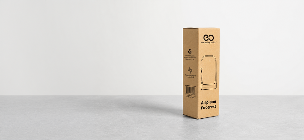
Airplane Footrest
For this packaging, I embraced Upper Echelon Products' belief that less is more. The goal was to create a clean, thoughtful design that highlights the product without unnecessary clutter. Using a single-color print on natural kraft packaging helped reduce material and ink usage while giving the box a simple, timeless look.
By focusing only on the essentials, the packaging feels approachable, functional, and aligned with the brand’s commitment to creating products that are both practical and environmentally conscious.
![AirplaneFootrest_B086TXRD3C_US_Packaging_editable (2) [Recovered].png](https://static.wixstatic.com/media/9a1d48_57836e5034ea45cfa511e0ee4a5cf0d6~mv2.png/v1/crop/x_165,y_24,w_3273,h_4549/fill/w_760,h_1056,al_c,q_90,usm_0.66_1.00_0.01,enc_avif,quality_auto/AirplaneFootrest_B086TXRD3C_US_Packaging_editable%20(2)%20%5BRecovered%5D.png)


